
3R RENOVATIONS
BRIEF
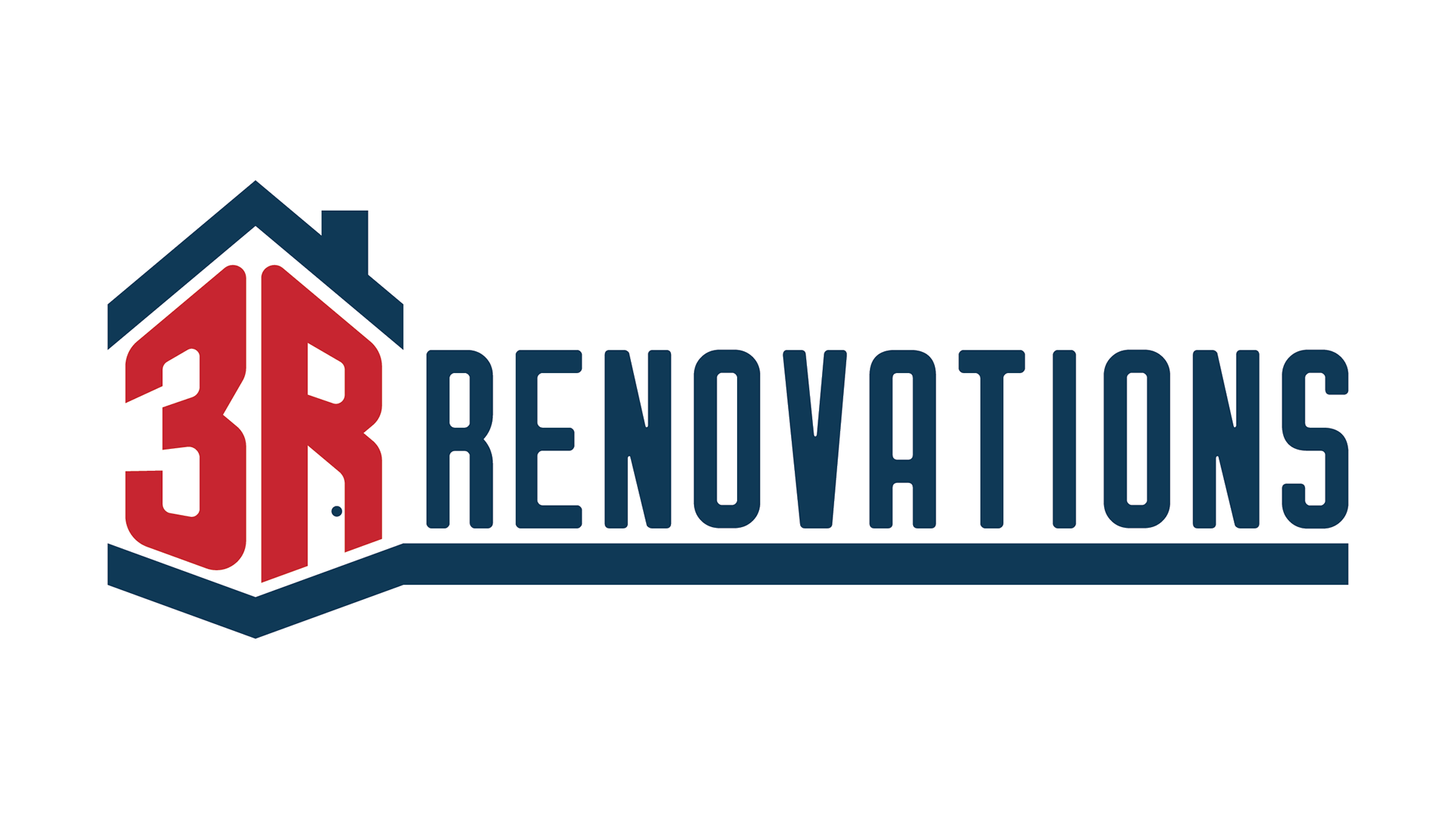
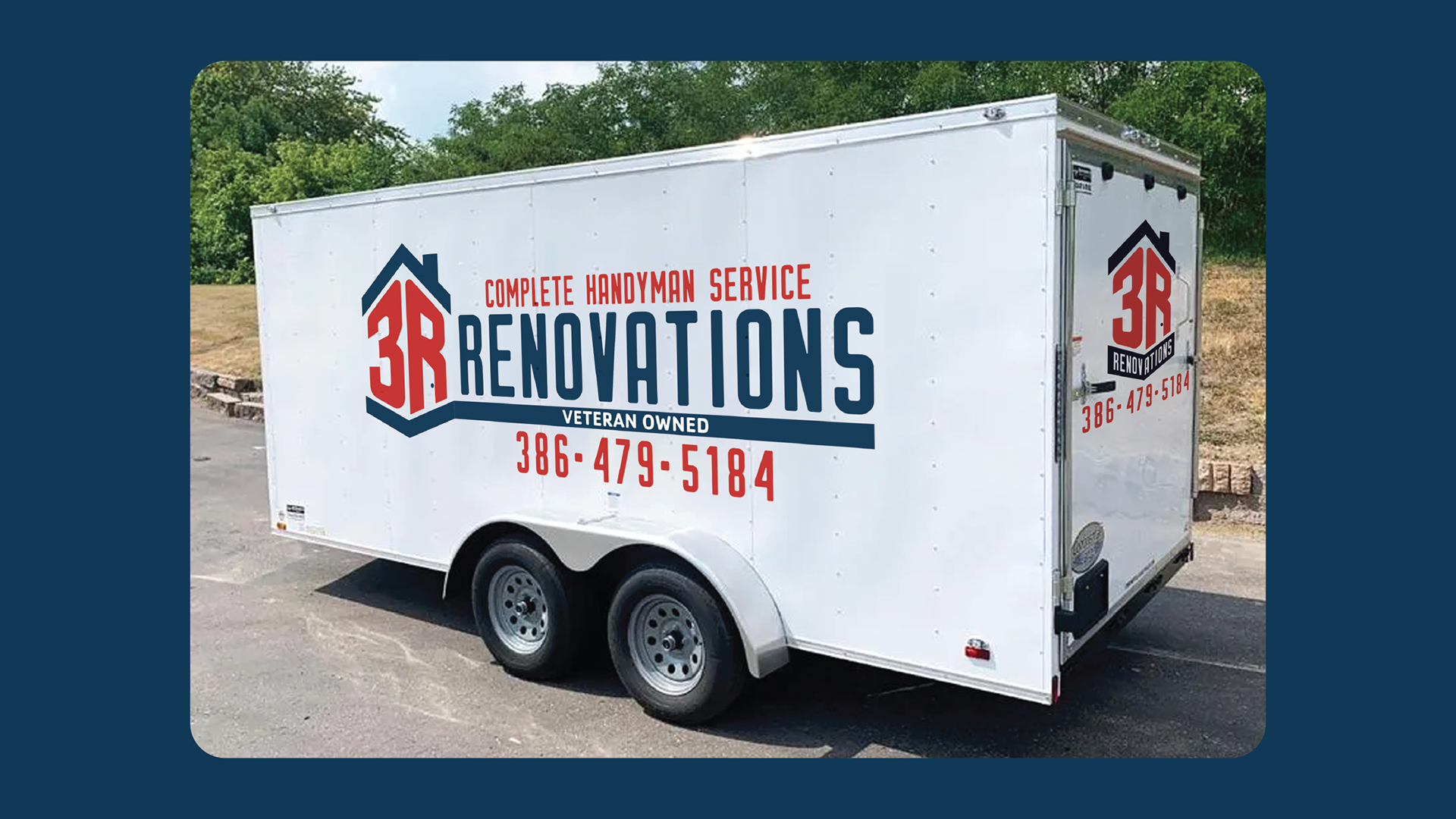
3R Renovations is a father-and-sons–owned company specializing in both residential and commercial renovations. They wanted a mark that clearly represented the concept of home and structure while reflecting the pride of being a veteran-owned business. Incorporating red, white, and blue into the brand palette was essential to honoring that identity.
SOLUTION
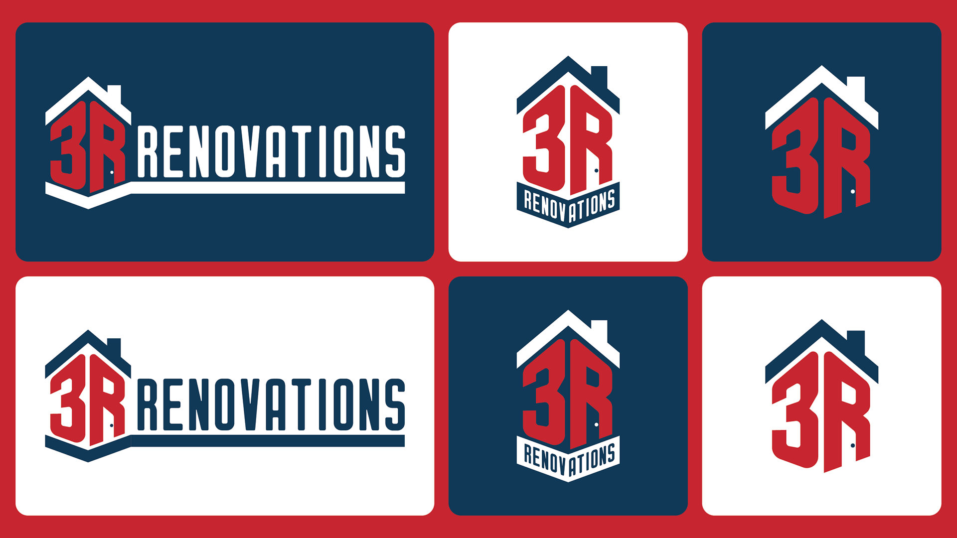
I transformed the “3R” into a dimensional focal point by introducing subtle perspective, giving the mark strength and depth. The letterforms became the structural core of the identity. I then framed the typography with a clean roofline above and a solid foundation below, each aligned to the same perspective; creating a cohesive, architectural silhouette.
The result is a bold, patriotic mark that feels stable, trustworthy, and built to last, just like the company itself.