
SMARTRON ELECTRIC
BRIEF
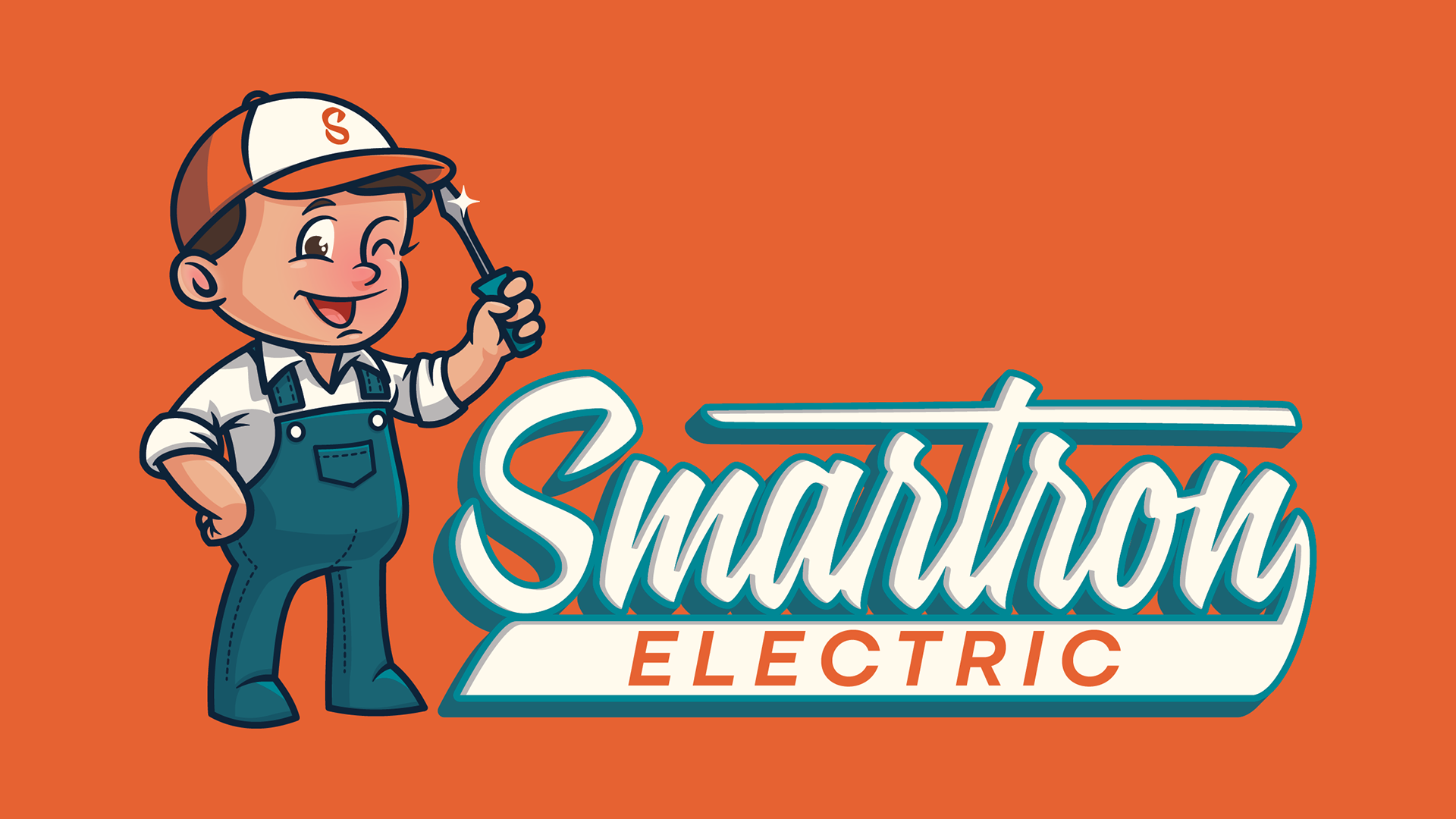
Ryan and Lissany, the owners of Smartron wanted to rebrand their electrical business. Their previous logo was modern and clean, which served well as a corporate identity; but they wanted a brand that felt more like the family-owned-and-operated company that they are. Their idea was to use their son as inspiration for a mascot. That along with a bit of a retro flair was what they gave me to build them a new identity that set them apart as a "electrician for the people"
SOLUTION
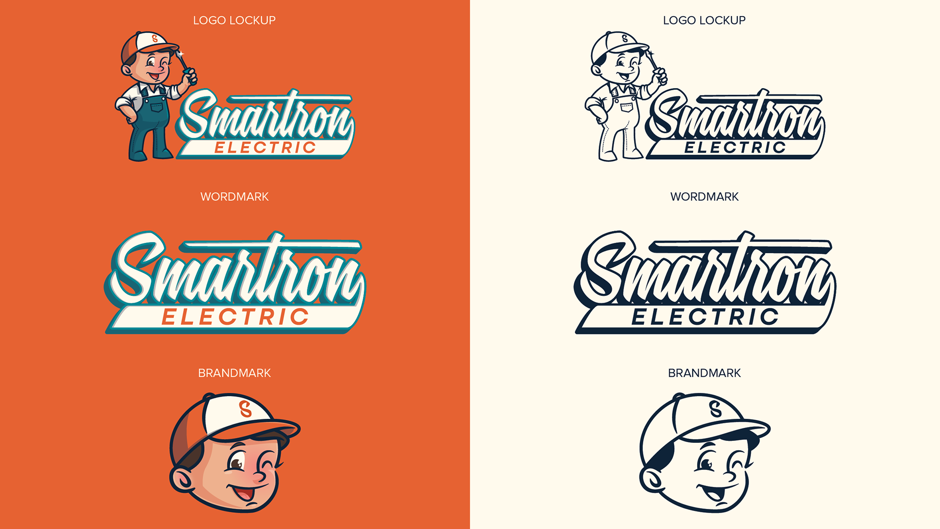
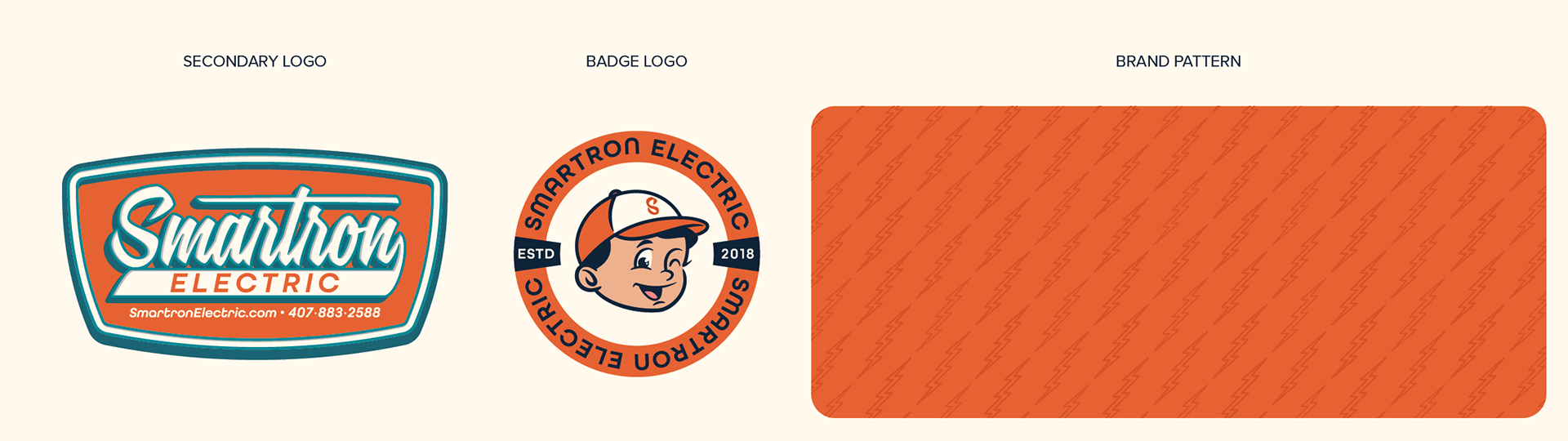
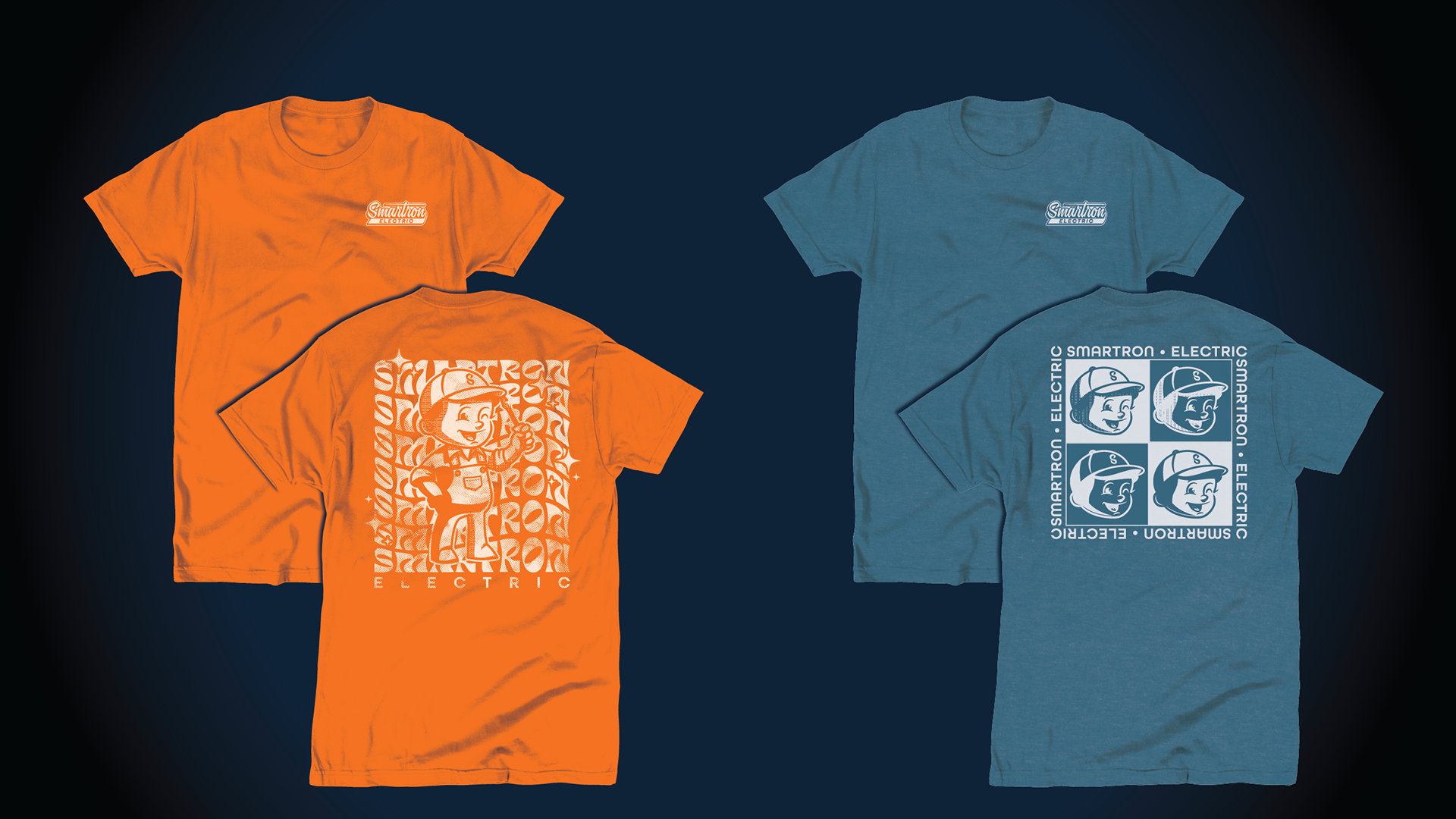
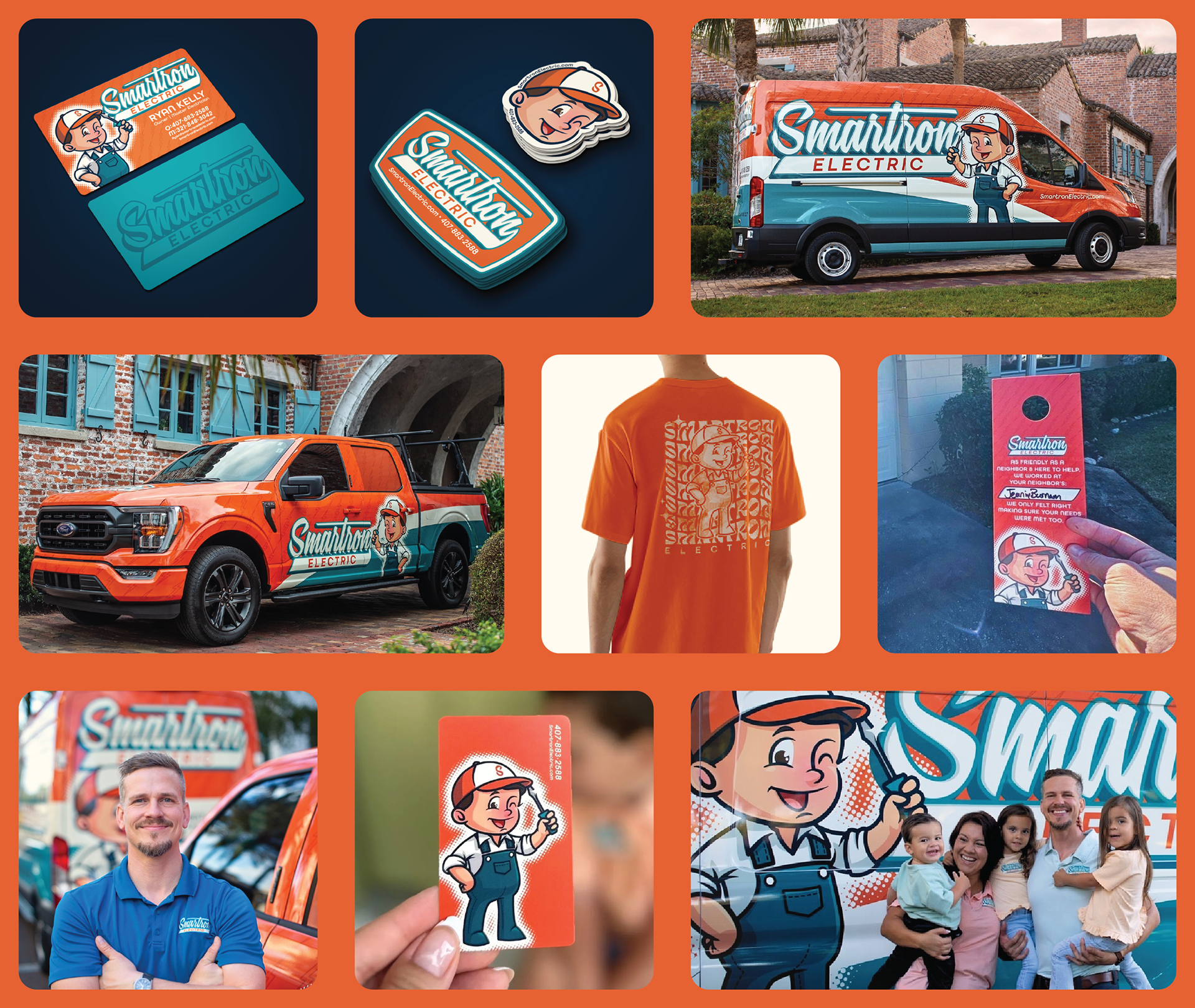
The design uses a large graphic of their mascot in a retro cartoon style wielding a flat-head screwdriver, the most used tool in an electrician's toolbox.
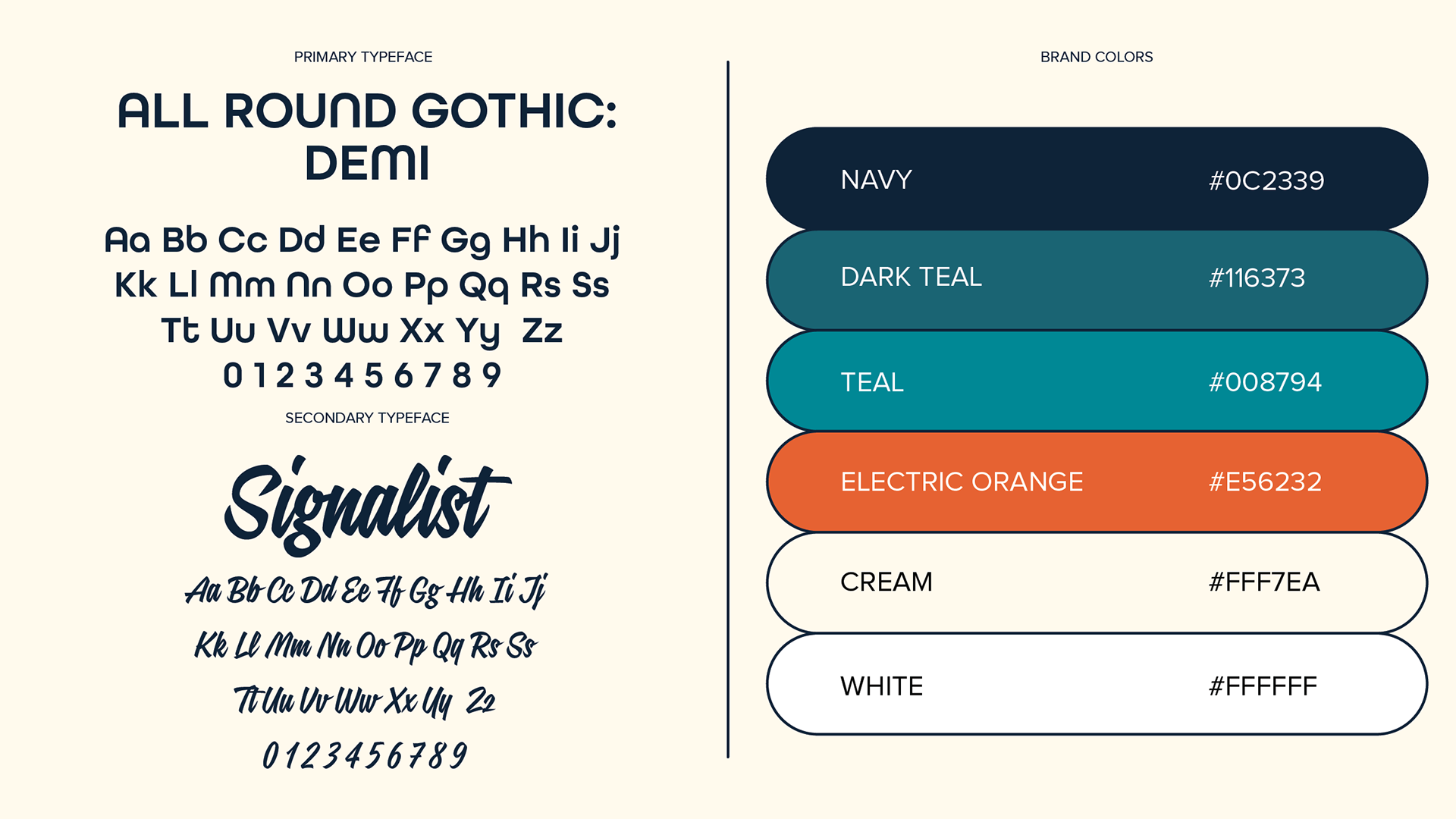
The wordmark uses a retro signage font as well as an art deco-style sans serif font to ground the whole design.
TESTIMONIAL
I wanted to take a moment to express my sincerest gratitude for the incredible work you've done in creating the logo for our company. Your creativity, talent, and attention to detail truly shine through in the final design, and we couldn't be happier with the result.
The logo you've crafted not only captures the essence of our brand but also sets the perfect tone for our identity in the marketplace. It's both visually striking and conceptually aligned with our company's values and vision.
Please know that your work has not gone unnoticed, and we will be sure to recommend your services to anyone in need of top-notch design expertise.
We look forward to the opportunity to work with you again in the future and further elevate our brand presence with your creative touch.
Once again, thank you for your outstanding work and for being an integral part of our journey. We wish you continued success and prosperity in all your endeavors. Ryan Kelly